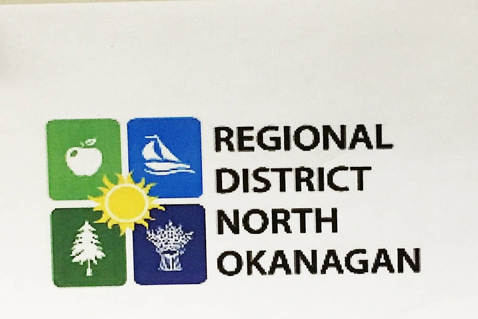
The Regional District of North Okanagan has developed a new coat of arms.
The new logo was unveiled at the RDNO board meeting Wednesday, developed by regional district staff.
“There was no branding exercise or cost associated with this,” noted RDNO board chair Bob Fleming, a reflection on how other civic governments have hired consultants and spend thousands of dollars to change logos or coat of arms.
“What we had found was the red, yellow and white colours on the existing logo weren’t really colour compatible with our website colours.”
The new logo is divided into four squares representing natural elements of the North Okanagan—boating, fruit growing, outdoors and agriculture—linked together in the centre by the sun.
Board members Michael Macnabb, director for Area C, and Vernon Mayor Akbal Mund both suggested the sun could perhaps be replaced by a snowflake as a winter version of the logo.
“We can take that under advisement but I don’t think that’s the direction we are going right now,” Fleming responded.
The board was also updated on the progress of the renovations to the RDNO board room.
It is expected to be unveiled to the public at a ribbon cutting ceremony prior to the board’s March 7 monthly meeting.
“It is on time and on budget,” Fleming noted.
