Designs for Vernon’s entrance signs continue to dominate political debate and consume staff time.
Administration presented another round of sign options Monday after the first draft was rejected in December. However, council still isn’t satisfied.
“It’s a bit of a back to the drawing board,” said Coun. Brian Quiring.
Quiring, who is an architect, raised numerous concerns about the latest designs, including the brushed aluminum background, the angle of the signs and the letter V.
“The V for Vernon looks like a caricature happy face. It doesn’t look sophisticated enough,” he said.
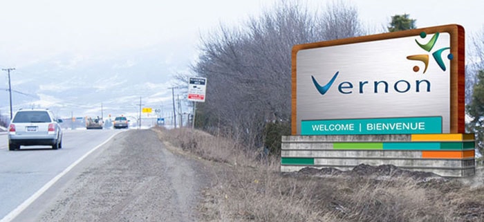
On the front of the sign, staff suggested possible wording of “Welcome,” “We’ve been waiting for you,” or the city slogan, “Activate life.”
Coun. Scott Anderson wants Activate life shelved.
“I’ve had several comments that it’s too clinical,” he said.
The primary difference between the two options is the location of the greetings and the city’s brand text.
In option one, the text is etched into the metal on the main body of the sign, while in option two, the text is located in a separate flat panel at the bottom of the sign. Option two would allow for the message to be changed.
Coun. Juliette Cunningham admits staff has put a lot of effort into the designs, but she says the proposals must be scrutinized.
“They will be there for awhile so it’s important to feel that we got it right,” she said.
In the end, council agreed to option two, but staff has been asked to review the reflective qualities of the material and to include the name Vernon on the rear of the sign.
A revised design will come back to council for consideration.
“The motion gives direction,” said Quiring.